
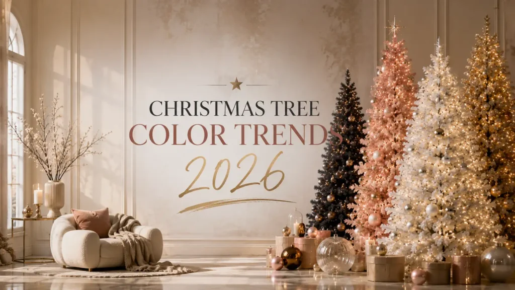
Two trees can be the same height, the same shape, and hold the same number of ornaments, and one will look styled while the other looks like a storage box was emptied onto it. The difference is almost always color.
Christmas tree color palettes shift alongside interior design. When brass hardware came back, gold ornaments followed. When homes moved toward warm neutrals and natural materials, so did tree decorating. Meanwhile, a handful of combinations have looked good for decades and will keep looking good, regardless of what shows up in a trend roundup this year or next.
This guide covers the color palettes shaping holiday decorating through 2026, how to build each one properly, which palette suits which type of home, and how to combine trend inspiration with a look you will still like in five years. It is written as decorating observation rather than prediction, because nobody can promise which colors will dominate a season. What can be promised is that the principles below work.
For calculators, buying guides, and the rest of our decorating library, start at MyChristmasTrees.online.
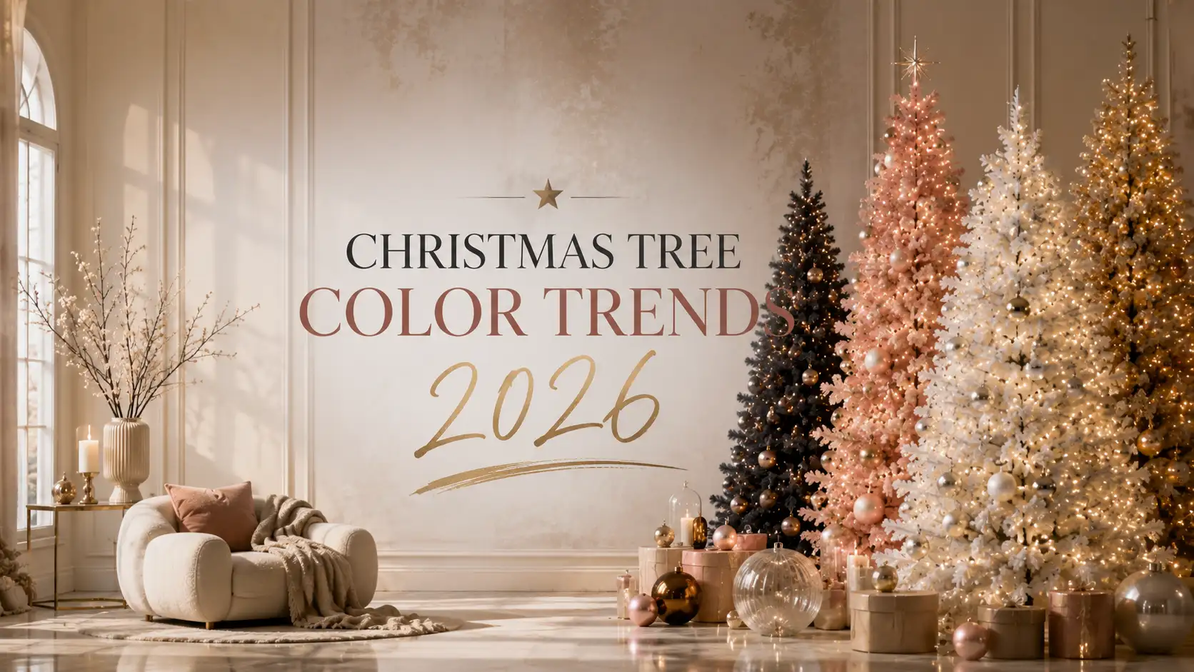
The Biggest Christmas Tree Color Trends For 2026
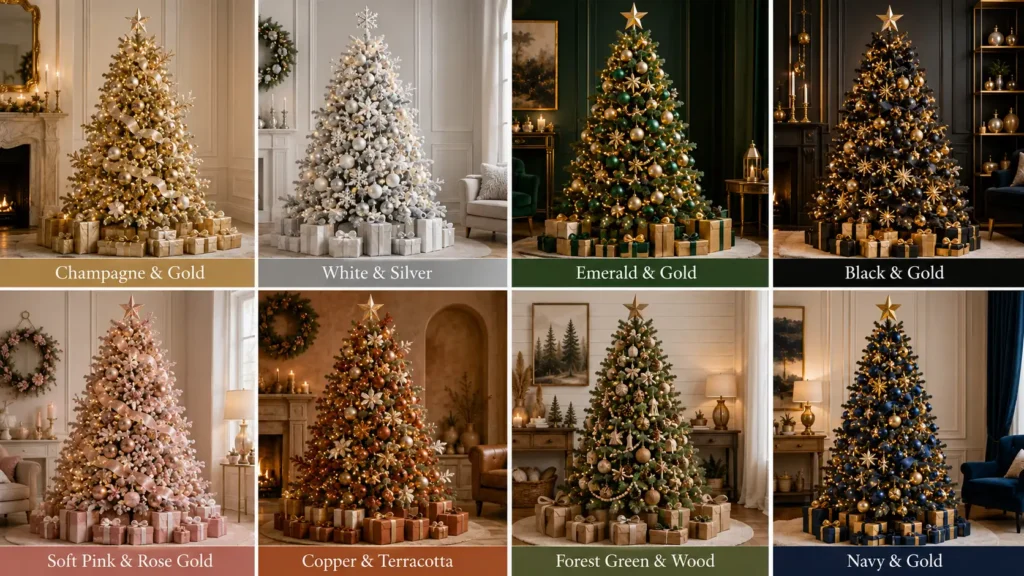
The strongest direction for 2026 is warm and restrained. Warm metallics, earthy tones, deep saturated jewel colors, and tightly controlled neutral palettes are all doing well. Cool, icy palettes have not disappeared but they have narrowed toward specific themes rather than being the default modern look.
| Color Palette | Mood | Best Room Style | Lighting | Difficulty | Timeless Rating |
|---|---|---|---|---|---|
| Champagne & Gold | Elegant, warm luxury | Formal, luxury, traditional | Warm white | Easy | Very high |
| White & Silver | Crisp, icy, wintry | Modern, coastal, winter themes | Cool white | Easy | High |
| Emerald Green & Gold | Rich, traditional, opulent | Traditional, classic, formal | Warm white | Moderate | Very high |
| Black & Gold | Dramatic, contemporary | Luxury, loft, modern | Warm white, high density | Hard | Moderate |
| Soft Pink & Rose Gold | Soft, glamorous, feminine | Glam, pastel, modern | Warm white only | Moderate | Moderate |
| Copper & Terracotta | Earthy, cozy, organic | Rustic, boho, warm modern | Warm white | Moderate | High |
| Forest Green & Wood | Natural, grounded, calm | Farmhouse, cabin, rustic | Warm white | Easy | Very high |
| Navy & Gold | Refined, unexpected, deep | Traditional, coastal, formal | Warm white | Moderate | High |
| Burgundy & Champagne | Warm, vintage, romantic | Traditional, Victorian, cozy | Warm white | Moderate | High |
| Neutral Earth Tones | Quiet, Scandinavian, textural | Scandinavian, minimalist | Warm white | Easy | Very high |
If you want one sentence: warm metallics on a neutral or deep base, with texture doing the work that extra colors used to do.
How Christmas Tree Color Trends Evolve
Interiors Lead, Trees Follow
Holiday palettes trail interior design by roughly a season or two. The move toward warm woods, unlacquered brass, clay tones, and muted greens in home décor showed up on trees as copper, terracotta, and forest green combinations. This is not coincidence. People buy ornaments that match the room they will sit in.
The practical implication is useful: if you want to guess where tree colors are heading, look at what paint companies and furniture retailers are doing, not at what tree retailers are doing.
Color Psychology Plays A Real Role
Warm colors, gold, copper, terracotta, and burgundy, read as inviting and comfortable. Cool colors, silver, icy blue, and stark white, read as clean and crisp. Neither is better, but they set genuinely different moods in a room.
A living room where the family gathers usually benefits from a warm palette. A formal entryway, a dining room used for hosting, or a room with lots of glass and white surfaces often looks better with cool tones. Matching the palette to how the room is actually used is more reliable than matching it to a trend list.
Social Media Compresses The Cycle
Visual platforms accelerate adoption dramatically. A palette that once took several seasons to spread now spreads within one. The downside is that palettes also burn out faster, and something that felt fresh in one season can feel over-exposed the next.
The defense against that is simple. Anchor your tree in a timeless base palette and let one element carry the trend. A champagne and gold tree with a single trendy ornament shape stays current. A tree built entirely from this year’s trend does not survive contact with next year.
Timelessness Versus Personal Style
Good palettes balance both. Purely timeless decorating can feel impersonal. Purely trend-driven decorating dates fast and costs more, because you replace it. The sweet spot is a classic foundation with personal touches layered on top, which is also the cheapest approach over a decade.
Trend #1: Champagne & Gold Luxury
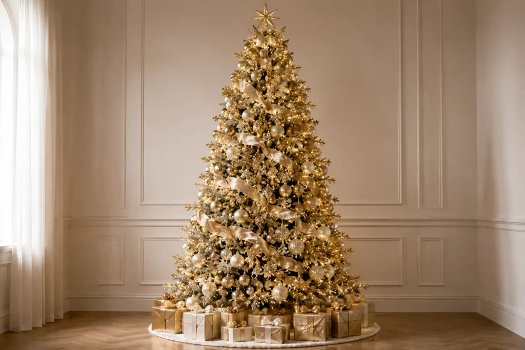
Champagne and gold is the most reliably beautiful palette on this list and the one we recommend most often when someone wants a tree that looks expensive without looking cold.
Why it works: Gold is warm, so it flatters skin tones, warm lighting, and wood furniture. Champagne softens gold and prevents the palette from tipping into brassy. Together they produce depth without needing a contrasting color.
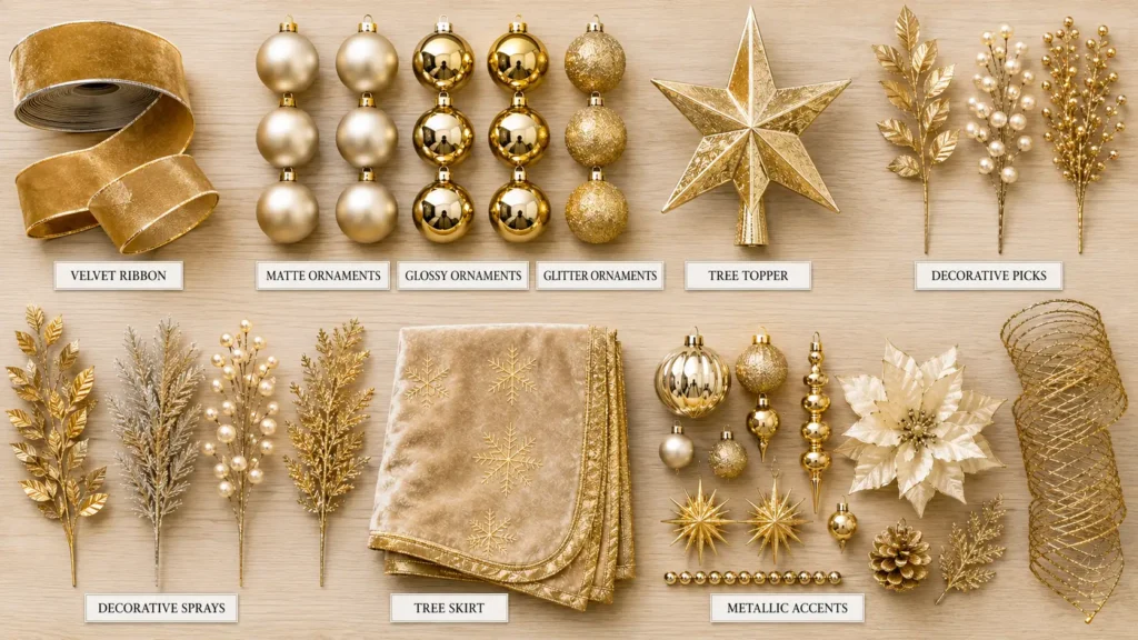
Ornaments: Mix three finishes in the same family. Matte champagne, polished gold, and glittered or textured gold. Add ivory and pearl as softeners. Vary size aggressively: 6 inch statement baubles at the interior, 3 to 4 inch mid-size on the main branches, and small fillers at the tips.
Ribbon: Wide champagne velvet or gold mesh, 4 inches or wider, placed vertically. For a 7.5 ft tree, plan on 30 to 40 feet. Vertical placement elongates the tree and looks more designed than horizontal wrapping.
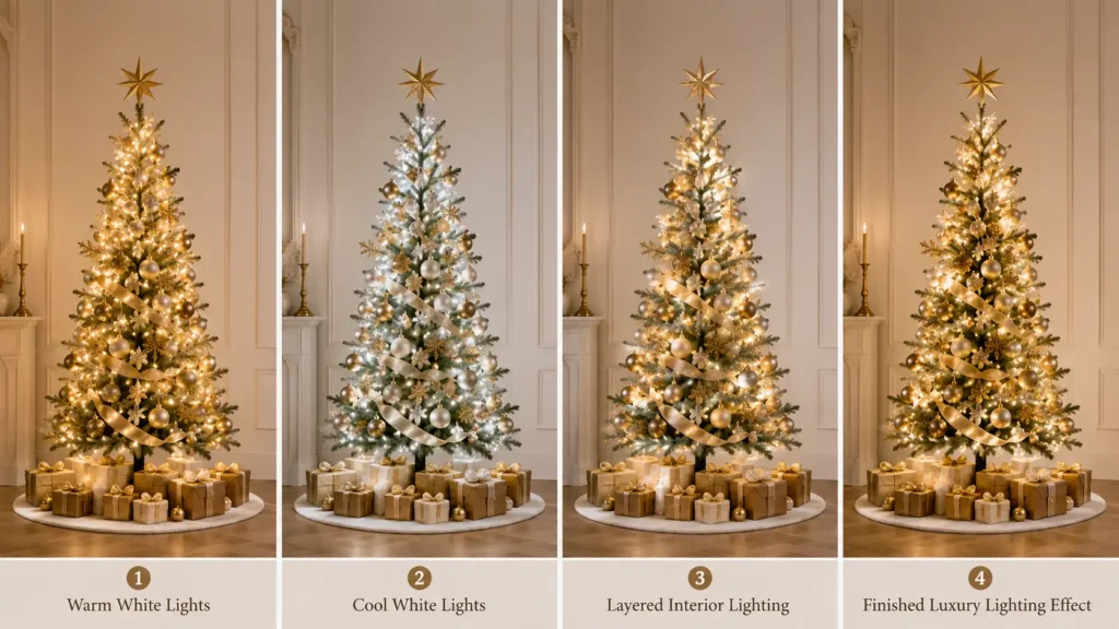
Lighting: Warm white, always. Cool white kills gold, turning it slightly greenish. Consider running toward the luxury benchmark of 150 to 200 lights per foot rather than the standard 100, because metallic ornaments reward extra light with extra reflection.
Tree topper: A large gold or champagne bow with long tails, or a simple gold star. Avoid a topper in a contrasting color.
Best for: Formal living rooms, entryways, homes with brass or gold fixtures, and neutral interiors.
Watch out for: Using a single shade of gold. A tree where every ornament is the same polished gold looks flat and slightly cheap. Finish variation is what creates the luxury effect. Our full breakdown of high-end layering is in luxury Christmas tree decorating ideas.
Trend #2: White & Silver Winter Elegance
The classic cool palette, and still the strongest choice for anyone chasing a true winter aesthetic.
Why it works: White and silver reflect light more than any other palette, which makes a tree read brighter at the same bulb count. It also photographs cleanly and suits rooms with a lot of natural light.
Ornaments: Frosted glass, mercury glass, clear faceted baubles, brushed silver, pewter, and pearl. Glass is the key material here. Solid plastic ornaments in silver tend to look flat, while glass catches and scatters light.
Crystal accents: Icicle ornaments, faceted drops, and crystal garland add sparkle without adding color. On a white and silver tree, sparkle replaces color contrast.
Ribbon: White or silver, with a subtle metallic thread. Avoid pure matte white ribbon, which disappears against a light tree.
Cool versus warm lighting: This palette is the exception where cool white genuinely wins. Cool white keeps the silver crisp and the whites bright. Warm white pushes everything toward ivory, which is attractive but no longer reads as winter. Pick one and commit, because mixing temperatures on a white tree is highly visible.
The problem to solve: White and silver on a white or flocked tree can dissolve into a single pale mass. Fix it with a dark anchor: charcoal ribbon, pewter ornaments, deep blue accents, or dark green foliage picks placed deep in the branches.
Best for: Modern homes, coastal interiors, rooms with white or grey walls, and formal winter themes.
Trend #3: Emerald Green & Gold
Traditional decorating with the volume turned up. This palette has come back strongly as saturated jewel tones returned to interiors.
Why it works: Emerald and gold is one of the oldest reliable color pairings in design, and on a green tree it creates a tonal effect where the emerald ornaments sit within the tree’s own color family while the gold provides contrast. That produces richness rather than competition.
Ornaments: Emerald glass baubles, gold-veined ornaments, brass finials, antique gold shapes, and a small amount of deep teal for depth. Glass emerald ornaments look dramatically better than matte ones because they catch light like gemstones.
Velvet ribbon: This palette is where velvet earns its place. Wide emerald or gold velvet ribbon adds the tactile richness that glass alone cannot. Velvet also absorbs light, which creates contrast against reflective ornaments.
Brass accents: Brass bells, brass stars, and antique brass finials read warmer and more traditional than polished gold. Mixing brass and gold is fine here, and actually improves the result.
Natural greenery: Fresh or faux cedar, magnolia leaves, and eucalyptus tucked into the branches extend the green range and add texture. This is one of the few palettes where adding real greenery to an artificial tree consistently improves it.
Best for: Traditional homes, formal dining rooms, homes with dark wood furniture, and anyone who wants classic Christmas without red.
Trend #4: Scandinavian Neutrals
Beige, linen, cream, pale wood, and white. The quietest palette here and one of the most durable.
Why it works: It relies on texture rather than color. When you remove color contrast, the eye starts noticing material differences: wool against wood, matte ceramic against woven straw, linen against glass. That is what makes a good Scandinavian tree interesting despite having almost no color.
Ornaments: Unfinished or lightly stained wooden shapes, straw stars, felted wool balls, ceramic bells, paper stars, and simple glass. Keep the ornament count moderate. This palette is one of the few where restraint improves the result.
Textures to include: Aim for at least four distinct materials. Wood, wool, paper, and glass is a good starting set. Add jute or linen ribbon rather than satin.
Ribbon: Natural linen, jute twine, or unbleached cotton. Narrow works here, which is unusual, because the whole look depends on understatement.
Lighting: Warm white, on the lower end of the density scale. Around 75 to 100 lights per foot is enough. Overly bright lighting fights the calm effect.
Best for: Scandinavian interiors, pale wood floors, white-walled rooms, minimalist homes, and small apartments where a busy tree would overwhelm.
Common failure: Adding metallics. A gold ornament on a Scandinavian tree instantly reads as a different palette intruding. If you want shine, use plain clear glass. The full approach is covered in our Scandinavian Christmas tree style guide.
Trend #5: Soft Pink & Rose Gold
Pink has matured. The bubblegum version has largely given way to blush, dusty rose, and mauve, which function as warm neutrals rather than as bright colors.
Why it works: Blush and rose gold are both warm, so they harmonize instead of competing. The palette reads soft and expensive rather than novelty, which is what separates it from earlier pink Christmas decorating.
Ornaments: Blush glass, rose gold metallics, champagne, cream, pearl, and blush velvet. Introduce depth with a slightly darker mauve or dusty rose rather than with a contrasting color.
Metallic accents: Rose gold is the primary metal. Small amounts of champagne gold work. Silver does not, because its coolness fights the warmth of blush.
Lighting: Warm white with no exceptions. Cool white lights give pink a grey cast and drain the warmth completely. This is the single most consequential lighting rule in this article.
Texture strategy: Because the palette is low contrast, texture carries the tree. Velvet bows, faux fur picks, feather sprays, matte ceramic, and pearl finishes all add interest without adding color.
Best for: Modern homes with soft palettes, glam interiors, bedrooms, home offices, and second trees.
Watch out for: Adding traditional red or green. It fights the palette and makes the tree look uncertain rather than intentional.
Trend #6: Black & Gold
The most dramatic palette on this list, and the one with the narrowest range of homes it suits.
Why it works: Maximum contrast. Gold against black appears to glow. The palette reads editorial and contemporary, closer to a hotel lobby than a family living room, which is precisely the appeal for some homeowners.
Ornaments: Oversized matte black baubles, polished gold, antique gold, crystal, and mirrored glass. Size matters enormously here. Small ornaments vanish. Use 4 to 6 inch ornaments as your workhorses.
Matte and gloss balance: All-glossy looks cheap, all-matte looks flat. Roughly a 60/40 split between matte and reflective produces the best depth.
Where it works: Homes with black window frames, dark accent walls, lofts, contemporary interiors, and rooms with strong architectural lines. It also works surprisingly well in an all-white minimalist room as a deliberate contrast object.
Where it does not: Farmhouse, cottage, coastal, and traditional interiors. Black in those rooms looks like it wandered in from another house.
Lighting requirement: This palette needs the most light of any on this list. Black absorbs rather than reflects, so plan for 150 to 200 lights per foot in warm white. On a 7.5 ft tree, that means roughly 1,125 to 1,500 lights instead of 750.
Trend #7: Copper & Terracotta
The warmest palette here and one of the most interesting developments in recent holiday decorating.
Why it works: Copper, terracotta, rust, and clay pull directly from the earthy interior palettes that have taken over living rooms. On a tree, they produce a warmth that gold cannot quite reach, and they pair beautifully with natural materials.
Ornaments: Copper metallics, terracotta ceramics, rust glass, burnt orange, warm bronze, and unglazed pottery finishes. Include a few cream ornaments to keep the palette from becoming muddy.
Natural materials: Dried orange slices, cinnamon bundles, pinecones, woven rattan shapes, and jute wrapped ornaments. This palette is at its best when roughly a third of the decorations are organic materials.
Ribbon: Rust velvet, burnt orange linen, or copper mesh. Matte textures suit this palette better than shiny ones.
Lighting: Warm white, and consider amber or vintage-tone bulbs if you can find them. The slightly golden cast enhances the earthy tones.
Best for: Boho interiors, warm modern homes, rooms with terracotta tile or clay accents, and anyone who finds traditional red too bright.
Trade-off to know: This palette can look muddy under dim lighting. It needs either good ambient light in the room or a generous tree light count to keep the tones separated.
Trend #8: Forest Green With Natural Wood
The most durable palette of the group and the closest thing to a can’t-fail option for anyone with a green tree.
Why it works: It leans into what the tree already is instead of fighting it. Deep green ornaments, wooden shapes, and natural textures create a tonal, layered look that feels grounded rather than decorated.
Ornaments: Wooden slices, carved wooden figures, deep green glass, pinecones, bark-textured baubles, and dried botanicals. Add a small amount of aged brass or matte bronze if you want warmth.
Pinecones: Use them at three scales. Small clustered picks in the interior, medium pinecones on branches, and one or two oversized cones near the base for weight.
Sustainability angle: This palette is unusually friendly to reusable and natural decorations. Wooden ornaments last indefinitely, and dried botanicals can be replaced cheaply each year rather than repurchased as plastic.
Ribbon: Plaid, buffalo check, burlap, or wide green velvet. This is one of the few palettes where patterned ribbon works well.
Best for: Farmhouse, cabin, rustic, and traditional homes, and anyone decorating around a lot of natural wood. The broader approach is covered in our rustic Christmas tree decorations guide.
Trend #9: Minimal Monochrome
One color. Nothing else. Executed properly, this is among the most sophisticated looks available.
Why it works: Removing color contrast forces everything else to matter more: the tree silhouette, the lighting quality, the ornament spacing, and the surface finishes. When those are right, the result looks confident.
The three main versions:
- All white. Matte, gloss, glitter, and frosted white ornaments on a green or white tree. Reads clean and modern.
- All gold. The most forgiving monochrome and the most luxurious. Vary matte, polished, and textured gold heavily.
- All silver. Crisp and cool. Works best with cool white lights and a lot of glass.
The rule that makes it work: minimum three finishes within the single color. Without finish variation, a monochrome tree looks unfinished rather than minimal.
Ornament count: Reduce by around 25 percent from the standard. A 7.5 ft tree that would normally take 75 to 100 ornaments works better with 60 to 75 in monochrome, because negative space is part of the design.
Lighting: Critical. With no color contrast, light is doing most of the work. Do not economize here.
Best for: Minimalist and modern homes, small apartments, and anyone who finds traditional decorating visually noisy. Our guide to minimalist Christmas tree ideas covers the wider philosophy.
Trend #10: Personalized Color Stories
The most interesting decorating direction right now is not a specific palette. It is people building their own.
How to build a personal palette in four steps:
- Pull two colors from the room. Look at your sofa, rug, curtains, and artwork. Choose the two colors that repeat most.
- Add one metallic. Gold if your room is warm, silver if it is cool, copper if it is earthy.
- Add one accent used sparingly. No more than 10 percent of ornaments. This is where personality lives.
- Keep sentimental ornaments but group them. Cluster mismatched heirloom ornaments in one section or one vertical band rather than scattering them. Grouping reads as deliberate, scattering reads as random.
That fourth step solves the most common real-world decorating problem. Most families own ornaments accumulated over twenty years that do not match anything. You do not have to abandon them, and you do not have to let them dictate the whole tree.
| Room Base Colors | Suggested Metallic | Suggested Accent | Resulting Palette |
|---|---|---|---|
| Cream, oak, brass | Gold | Sage green | Warm neutral luxury |
| Grey, white, chrome | Silver | Icy blue | Cool modern winter |
| Navy, walnut, leather | Antique brass | Burgundy | Deep traditional |
| Terracotta, rattan, linen | Copper | Cream | Earthy organic |
| Black, concrete, steel | Gold | Crystal | Contemporary dramatic |
| Blush, velvet, light wood | Rose gold | Pearl white | Soft modern glam |
Choosing The Right Color Palette For Your Home
| Home Style | Best Palettes | Palettes To Avoid | Reasoning |
|---|---|---|---|
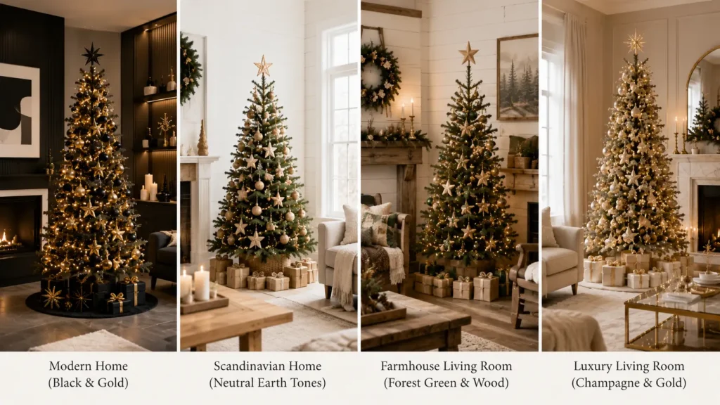
| Modern | Black & gold, monochrome, white & silver | Plaid rustic, multicolor | Clean lines suit restricted palettes |
| Farmhouse | Forest green & wood, copper & terracotta | Black & gold, pink & rose gold | Natural texture defines the style |
| Scandinavian | Neutral earth tones, all white | Heavy metallics, jewel tones | Restraint and pale wood dominate |
| Luxury | Champagne & gold, emerald & gold, black & gold | Casual naturals, multicolor | Contrast and metallics read expensive |
| Traditional | Emerald & gold, burgundy & champagne, navy & gold | Monochrome silver, terracotta | Classic rooms want classic depth |
| Small Apartment | Monochrome, neutral earth tones, white & silver | Busy multicolor, heavy jewel tones | Light palettes keep small rooms open |
Expert Recommendation
If you are choosing a palette for the first time and want something that will still look right in a decade, pick champagne and gold for a warm home or white and silver for a cool one. Both are forgiving, both photograph well, both suit a wide range of rooms, and both let you add trend pieces each year without rebuilding the whole tree.
Colored Trees vs Colored Decorations
There are two different ways to bring color to a Christmas tree, and they solve different problems.
Decorating a green tree with a color theme is the flexible option. The green functions as a neutral backdrop that flatters nearly every ornament color. You can run emerald and gold this year, copper and terracotta next year, and monochrome white the year after, all on the same tree. The initial investment is lower and the risk is minimal.
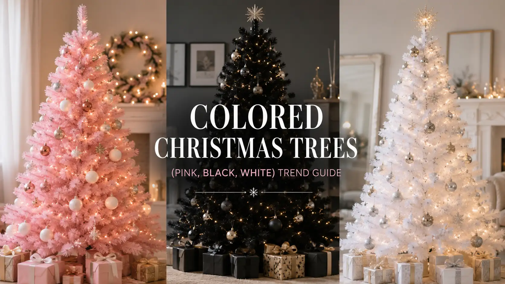
Buying a colored tree commits you. A black or blush tree locks in a large portion of your palette before you hang a single ornament, and it narrows which ornaments will work. The payoff is a stronger, more designed effect that a green tree cannot fully replicate, especially in modern interiors.
| Factor | Green Tree With Color Theme | Colored Tree |
|---|---|---|
| Palette flexibility | Change every year | Locked to the tree color |
| Upfront cost | Lower | Typically 10 to 30 percent higher |
| Ornament compatibility | Nearly universal | Narrow, palette-specific |
| Visual impact | Strong when well styled | Immediate and dramatic |
| Beginner friendly | Yes | Moderate to difficult |
| Longevity if décor changes | High | Lower |
Our recommendation for most people: decorate a green or flocked tree with a strong color theme. It delivers 80 percent of the effect at a fraction of the commitment. If you already have a settled interior style and a clear vision, a colored tree is genuinely worth it, and our colored Christmas trees trend guide covers how to choose and decorate each color.
How Lighting Changes Every Color Palette
Lighting is the single largest factor in how a color palette reads, and it is consistently underestimated.
Warm white lights add a golden cast. They enhance gold, copper, terracotta, burgundy, emerald, blush, and wood tones. They make a room feel cozy. They are the correct default for roughly 80 percent of the palettes in this article.
Cool white lights add a blue-white cast. They enhance silver, crystal, icy blue, and pure white. They make a room feel crisp and clean. They are the correct choice for white and silver winter palettes and generally the wrong choice for anything warm.
The mixing rule: do not combine warm and cool white on the same tree. The difference is far more visible in person than it appears in product photos, and the result looks accidental rather than layered.
Layered lighting is the professional technique that separates good trees from great ones. Run one string deep near the trunk, one on the mid-branches, and one on the outer tips. The interior lights create a glow that makes the tree look like it has depth rather than a lit surface.
Reflection multiplies everything. Glass, mirrored, and faceted ornaments act as secondary light sources. A tree with 800 lights and glass ornaments looks brighter than one with 1,000 lights and matte ornaments. This is why metallic palettes look so effective at moderate light counts and why matte palettes need more.
For a full technical walkthrough of bulb types and string configurations, see our Christmas tree lights and lighting guide. If the color temperature decision is what is holding you up, our comparison of warm white vs cool white lights resolves it directly.
| Tree Height | Minimalist (50 to 75/ft) | Standard (100/ft) | Luxury (150 to 200/ft) |
|---|---|---|---|
| 4 ft | 200 to 300 | 400 | 600 to 800 |
| 6 ft | 300 to 450 | 600 | 900 to 1,200 |
| 7.5 ft | 375 to 560 | 750 | 1,125 to 1,500 |
| 9 ft | 450 to 675 | 900 | 1,350 to 1,800 |
| 10 ft | 500 to 750 | 1,000 | 1,500 to 2,000 |
For the reasoning behind these figures and how they shift with tree width, read how many lights do you need for a Christmas tree, or enter your dimensions into the Christmas tree light calculator and get the number directly.
Planning Decorations Before You Shop
Buying ornaments without a plan is how people end up with four half-finished palettes and a tree that satisfies none of them.
Ornament balance. Work in a 60/30/10 split. Sixty percent primary color, thirty percent secondary, ten percent accent. This ratio comes from interior design and it works just as well on a tree. Quantities by height: 25 to 40 ornaments for a 4 ft tree, 50 to 75 for a 6 ft tree, 75 to 100 for a 7.5 ft tree, 100 to 150 for a 9 ft tree, and 150 to 200 for a 10 ft tree.
Size distribution. Roughly 20 percent large ornaments, 50 percent medium, 30 percent small. Large ornaments go deep in the branches to create shadow and depth, small ones go at the tips.
Ribbon. Buy wide, 4 inches or more. Narrow ribbon reads as an afterthought from across the room. Plan 15 to 25 feet for a 6 ft tree, 30 to 40 feet for a 7.5 ft tree, 40 to 60 feet for a 9 ft tree, and 60 to 75 feet for a 10 ft tree.
Picks and sprays. The most underused decorating tool. Picks fill gaps, extend the silhouette, and add texture that ornaments cannot. Ten to fifteen picks will meaningfully change how a tree reads.
Tree topper. Choose it at the same time as the palette, not at the end. A topper in a color outside the palette undoes the coordination of everything below it.
Budget planning. Allocate roughly 40 percent of your decorating budget to lighting, 35 percent to ornaments, 15 percent to ribbon and picks, and 10 percent to the topper and skirt. Most people invert this and spend heavily on ornaments while underlighting the tree, which is why so many well-decorated trees still look flat.
To get exact quantities before you shop, run your tree through our Christmas tree decoration calculator for a complete inventory, or the Christmas tree ornament calculator if ornament count is all you need.
Which Tree Types Work Best?
Flocked trees suit white, silver, neutral, and Scandinavian palettes exceptionally well, and they make gold and copper look warmer by contrast. The trade-offs are shedding and a slightly more involved cleanup. Our guide to flocked Christmas trees covers quality differences and how to reduce mess.
Pre-lit trees solve the biggest execution problem in this article, which is inadequate lighting. They typically save 30 to 90 minutes at setup and deliver more even coverage than most people achieve by hand. Check the light color temperature before buying, because it locks in one half of your palette decision. Our guide on how to choose the perfect pre-lit Christmas tree covers what to check, and the ultimate guide to pre-lit Christmas trees goes deeper into repairs and long-term care.
Slim trees measure 30 to 45 inches wide against 50 to 70 for a traditional tree. They pair naturally with monochrome and minimal palettes because there is less surface area to fill. In apartments, height creates more impact than width.
Traditional full trees at 60 to 80 inches wide give you the most surface for layered, multi-texture palettes like emerald and gold or forest green and wood. If your palette depends on depth and layering, you want the width.
Sizing note for every type: leave 6 to 12 inches between topper and ceiling. On an 8 ft ceiling that means a 6 to 7.5 ft tree, and on a 9 ft ceiling, 7.5 to 8.5 ft. Most people buy trees that are too tall for the room, and a tree squeezed against the ceiling undermines even a perfect palette.
Trend Inspiration Beyond Color
Color is one variable. Shape, placement, format, and texture matter too, and some of the most interesting current decorating has nothing to do with palette.
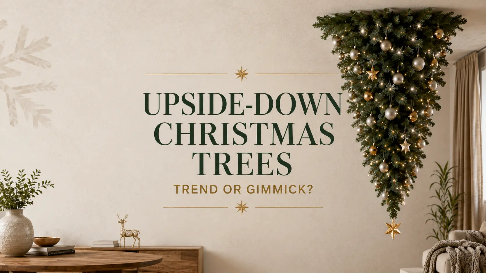
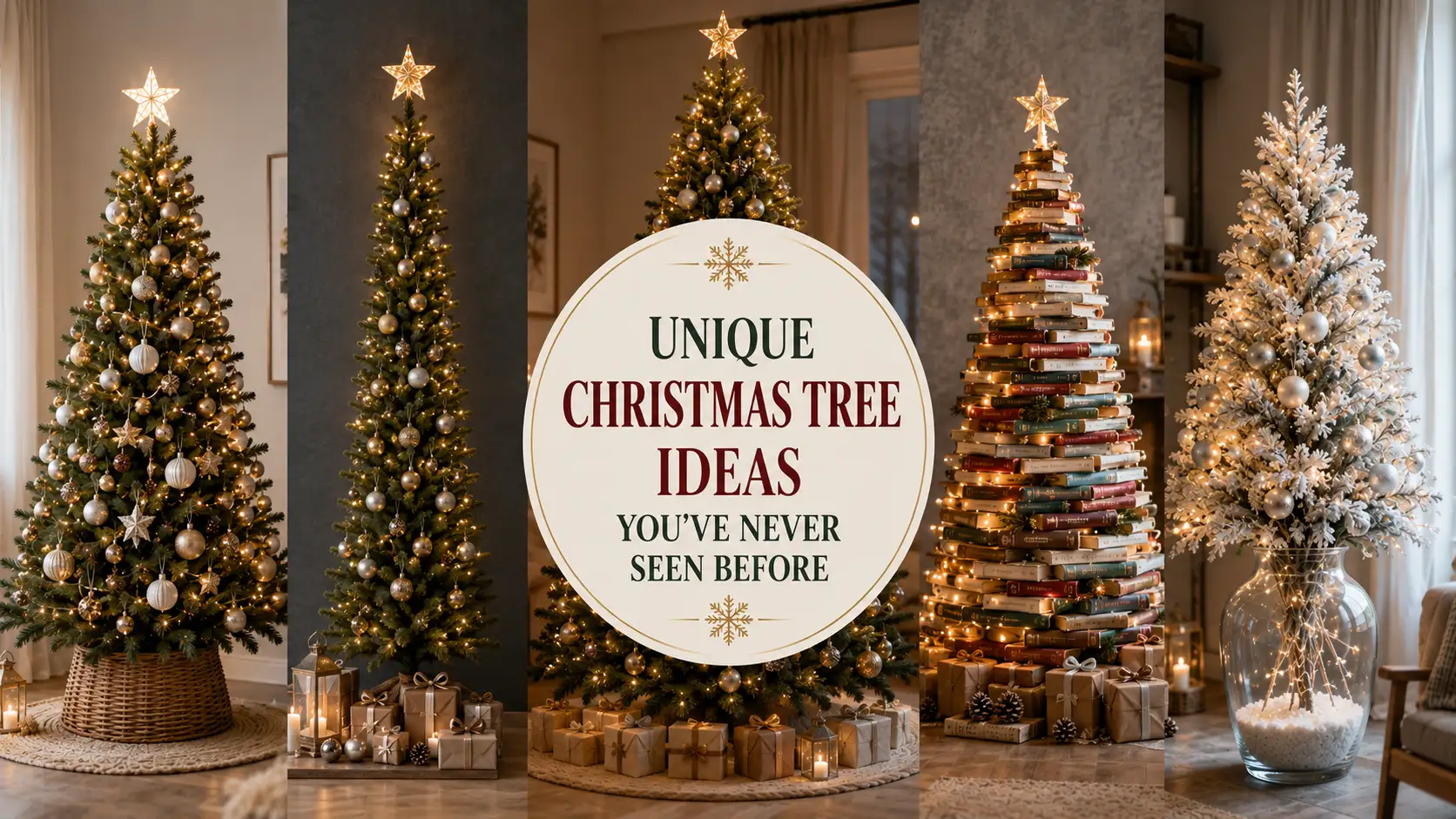
Our roundup of viral Christmas tree trends on TikTok covers what is spreading fastest and which techniques actually translate to real living rooms. For alternative formats, particularly useful in small spaces, our collection of unique Christmas tree ideas covers wall trees, ladder trees, and other departures from the standard cone. And for a genuinely divisive format, our assessment of upside down Christmas trees weighs whether the practical benefits justify the look.
How to use inspiration without copying it. Take one idea, not the whole image. If a tree you liked used a copper and cream palette with dried orange slices, take the palette and skip the orange slices if they do not suit your room. Trends work best as a source of individual ideas rather than as a template to reproduce. The trees people love long-term are almost always the ones that borrowed selectively.
Common Color Mistakes
Too many metallics. Gold, silver, copper, and rose gold on one tree cancel each other out and the tree reads as unplanned. Fix: choose one dominant metal and allow one secondary at no more than 20 percent.
Clashing warm and cool colors. Silver ornaments on a copper and terracotta tree, or blush pink with icy blue. The temperatures fight. Fix: decide whether your palette is warm or cool at the start, and reject anything from the other side.
Ignoring the room. A palette chosen in isolation from wall color, flooring, and furniture will look imported. Fix: pull at least one color from the room and repeat it on the tree.
Wrong lighting temperature. Cool white on gold, warm white on silver, or both mixed together. Fix: warm white for warm palettes, cool white for cool ones, and never both.
Overdecorating. More ornaments does not mean a better tree, particularly with tightly controlled palettes. Fix: decorate to what you think is 75 percent, step back ten feet, then decide whether more is needed. Usually it is not.
Poor ornament balance. All medium-sized ornaments, evenly spaced, is the most common structural mistake. It produces a polka-dot effect with no depth. Fix: use the 20/50/30 size split and push large ornaments deep into the branches.
Buying before planning. Fix: choose the palette first, write it down, and buy only within it. This one habit prevents most of the mistakes above.
Expert Perspective
The best Christmas tree color trend is not necessarily the newest one.
Every year produces a list of palettes described as the definitive look of the season, and every year a meaningful share of those palettes are quietly gone within two. Meanwhile, champagne and gold, forest green and wood, and white and silver keep showing up, because they were never really trends. They are just good color combinations.
Beautiful holiday decorating comes from a balanced palette that complements the home, reflects genuine personal taste, and still looks right long after the trend cycle has moved on. Color should enhance the atmosphere of a room rather than compete with it. A tree that fights the room it stands in will never look finished, no matter how fashionable the palette.
There is also a practical argument. Rebuilding a tree’s palette from scratch costs real money. Choosing a durable base palette and adding a handful of new pieces each year is cheaper, less wasteful, and produces a tree that improves rather than resets every December.
What We’d Choose
For a warm home: champagne and gold as the base, with copper accents added gradually over several seasons. Warm white lighting at the luxury density. It looks expensive, it suits most rooms, and it will not date.
Final Verdict: Which 2026 Color Trends Are Worth Trying?
Worth committing to:
- Timeless luxury palettes. Champagne and gold, emerald and gold, and burgundy and champagne are decades-proven and unlikely to feel dated.
- Nature-inspired colors. Forest green with wood, and copper with terracotta, are grounded in materials rather than fashion, which makes them durable.
- Minimalist neutrals. Scandinavian palettes and monochrome schemes suit modern homes, cost less to execute well, and age gracefully.
- Soft metallic combinations. Blush with rose gold, and champagne with pearl, deliver warmth and shine without the harshness of high-contrast palettes.
- Personalized color stories. The most satisfying option for most households, because the tree reflects the actual room and the actual family rather than a catalog.
Worth trying carefully: black and gold, which is spectacular in the right room and wrong in most others.
Worth skipping unless you love it: any palette you are choosing purely because it appeared on a trend list. If a palette does not make you want to sit in the room with the lights on, it is not the right palette regardless of how current it is.
Frequently Asked Questions
1. What are the trending Christmas tree colors for 2026? Warm and restrained palettes are leading. Champagne and gold, emerald and gold, copper and terracotta, forest green with natural wood, and neutral Scandinavian tones are all strong. Black and gold continues in modern and luxury interiors, and blush with rose gold has matured into a softer, more neutral version of pink decorating.
2. Are traditional red and green Christmas colors still popular? Yes, and they are not going anywhere. What has changed is the execution. Deeper, richer versions like emerald and burgundy are more common than bright primary red and green, and they tend to look more sophisticated in modern interiors.
3. How many colors should a Christmas tree have? Two primary colors plus one metallic is the reliable formula. Use a 60/30/10 split between primary, secondary, and accent. Adding a fourth color is the most common way a well-planned tree tips into looking cluttered.
4. What Christmas tree colors look most expensive? Champagne and gold, emerald and gold, and black and gold consistently read as high-end. The reason is not the colors themselves but the technique they encourage: warm metallics, multiple finishes within one color family, generous lighting, and wide velvet ribbon.
5. Can you mix gold and silver on a Christmas tree? It can work, but only with deliberate execution. Choose one as dominant at roughly 70 percent and the other as accent, and add a neutral like cream or white to bridge them. Equal amounts of both usually looks indecisive rather than layered.
6. What color lights work best with a gold color palette? Warm white. Cool white gives gold a slightly greenish cast and drains its richness. This applies equally to copper, brass, bronze, and rose gold.
7. How do I choose a Christmas tree color palette for my home? Start with the room, not the tree. Identify the two colors that repeat most in your furniture, rug, and artwork, add a metallic that matches your existing hardware, and include one accent used sparingly. That approach produces a tree that looks like it belongs in the room.
8. Is it better to buy a colored tree or decorate a green tree with a color theme? For most people, decorate a green or flocked tree. It costs less, works with almost any ornament, and lets you change the palette annually. A colored tree makes sense when you have a settled interior style and want a stronger designed effect.
9. How many ornaments do I need for a color-themed tree? Roughly 50 to 75 ornaments for a 6 ft tree, 75 to 100 for a 7.5 ft tree, and 100 to 150 for a 9 ft tree. Reduce by around 25 percent for monochrome or minimalist palettes, where negative space is part of the design.
10. What is the most timeless Christmas tree color combination? Forest green with natural wood, and champagne with gold. Both have looked good for decades, suit a wide range of interiors, and do not depend on any particular design moment to make sense.
11. Do metallic ornaments make a tree look brighter? Yes, measurably. Reflective and faceted ornaments act as secondary light sources, bouncing bulb light back out. A tree with metallic and glass ornaments looks noticeably brighter than one with the same light count and matte decorations.
12. Should I change my Christmas tree color palette every year? It is rarely worth the cost. A better approach is a durable base palette with a handful of new pieces added each season. The tree evolves gradually, the expense stays manageable, and you avoid the storage problem of owning several complete but incompatible ornament sets.
Conclusion
Christmas tree color trends for 2026 point in a consistent direction: warmer metallics, deeper saturated tones, earthy naturals, and tightly controlled neutral palettes. Champagne and gold, emerald and gold, copper and terracotta, forest green with wood, and Scandinavian neutrals are all strong choices, and each suits a distinct type of room.
The mechanics matter as much as the palette. Match your lighting temperature to your colors, use warm white for warm palettes and cool white for cool ones, and never mix the two on one tree. Buy wide ribbon. Vary ornament sizes and finishes rather than relying on color contrast alone. Spend on lighting before ornaments, because a well-lit tree with modest decorations beats an expensive tree that is underlit every time.
Above all, choose the palette against the room you actually have. Pull the colors from your furniture and walls, add a metallic that matches your hardware, and keep one accent for personality. That is how a tree ends up looking designed rather than decorated.
Trends are useful as inspiration and unhelpful as instructions. The palette worth choosing is the one you will still want to switch the lights on for in five years, not the one that happened to be popular the year you bought it.